Discover Spatial Patterns with Heat Map in vMAP
One of the basic foundations of spatial analysis revolves around understanding patterns and trends of various phenomena. You might be interested in finding where do traffic accidents mostly occur, where do petty crimes usually happen, or even where do coffee shops concentrate around the city. In GIS, we often use heat maps to describe and visualize this information so that it will be easily communicated to the viewers.
What are heat maps?
Heat maps provide an intuitive way of visualizing the density or concentration of a certain spatial entity in a geographic area. This should not to be confused with maps that literally displays the measured ground temperature. Usually, high concentration or density values are symbolized with warm colors such as red, orange, and yellow, while those with low values are often symbolized with cool shades such as blue and purple.
How do you make a heat map?
Most GIS software programs nowadays have a straightforward heat map visualization tools such that users can easily create one without clicking too many buttons. Even in those browser-based web applications, simplified and easy-to-use heat mapping tools are becoming a thing. With this, people with little or has no background in GIS at all can easily visualize patterns that they need to investigate.
In this section, I’ll be showing you how you can create a heat map and then share this to your colleagues over the web in just a few simple steps with vMAP.
The platform, vMAP, is an emerging, web-based, software-as-a-service GIS solution that offers data visualization and other mapping capabilities for various industries. The simplified interface makes it an appealing GIS choice especially for those who are not that tech-savvy people who also need to unravel trends and patterns in their spatial data and effectively communicate information in the web.
Let’s say you are working for a non-profit organization whose cause revolves around providing quality education to public schools in third-world countries, such as the Philippines. And for a certain project to be more effective, you need to identify the locations of schools with higher enrollment rates compared to others. Traditionally, we can do this by simply querying and sorting the list of our schools based on the number of enrolments. However, you learned that for the project to be more successful in the long run, you may need to target locations that are near each other, to somehow trigger a ripple effect that will sustain the project in the future. So of course, a map is a better choice over the long list of schools in a table.
In vMAP, we can plot the location of these public schools first by importing the shapefile into the application. Looking at the fields of the schools point data, we’ve learned that there’s information on the total enrollments that we can use to identify our potential project sites.
Using the Heat and Cluster style settings, we can apply a heat mapping symbology to the point data, such that, we can visualize where the concentrations of the schools with the highest number of enrolments are. For the pilot of our project, we decided to focus on the metropolitan area, the National Capital Region.
In creating the heat map, one thing that we must consider is the search radius. This is the area around each cell that the software will factor in the density calculation. Setting a smaller value will give us a very restricted interpolation. On the contrary, setting a higher value will give us a more generalized map. Which is why, in choosing a search radius value, we should consider the scale and purpose of the map that we need.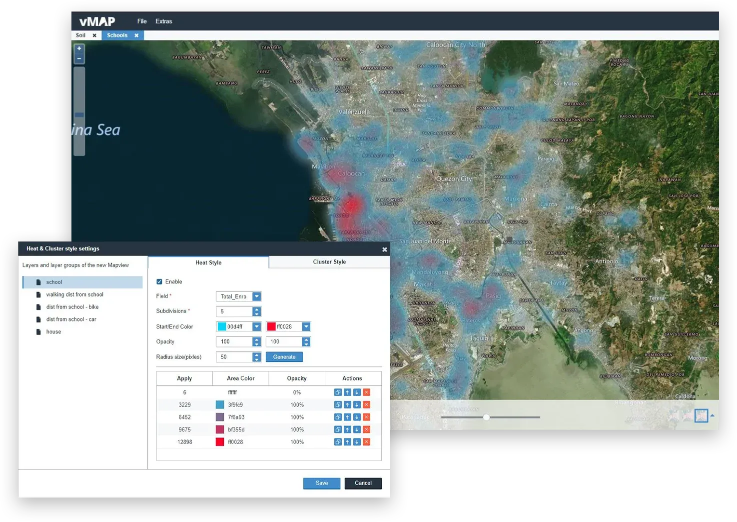
In this map, we can visualize that most of the schools with high enrolment rates are located in the western part of NCR, especially in the vicinity of the City of Manila. There are also some red areas in the eastern part near the vicinity of Pasig City, which can also be other candidates for the project.
After creating the heat map, we can then share the web map to other project members in the organization using the Share map list capability. In sharing the web map, we have several options including sharing the map to the public or certain people only using a password. We can also set a time for its accessibility.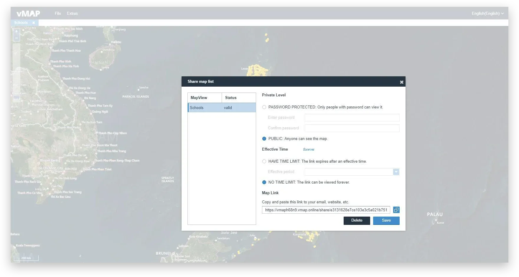
In this example, we saw how creating and sharing heat map using vMAP can be done in just a few clicks. We were able to identify the potential sites for our project at a higher level, so we can filter the data and conduct further investigation. And most importantly we found a way to effectively communicate our result to a broader audience.